Understand your data with principle component analysis (PCA) and discover underlying patterns - Enhanced data exploration that goes beyond descriptives
Save time, resources and stay healthy with data exploration that goes beyond means, distributions and correlations: Leverage PCA to see through the surface of variables. It saves time and resources, because it uncovers data issues before an hour-long model training and is good for a programmer’s health, since she trades off data worries with something more enjoyable. For example, a well-proven machine learning model might fail, because of one-dimensional data with insufficient variance or other related issues. PCA offers valuable insights that make you confident about data properties and its hidden dimensions.
This article shows how to leverage PCA to understand key properties of a dataset, saving time and resources down the road which ultimately leads to a happier, more fulfilled coding life. I hope this post helps to apply PCA in a consistent way and understand its results.

“Beauty and health require not only education and knowledge, but also thorough data exploration.” (~Plato)
TL;DR
PCA provides valuable insights that reach beyond descriptive statistics and help to discover underlying patterns. Two PCA metrics indicate 1. how many components capture the largest share of variance (explained variance), and 2., which features correlate with the most important components (factor loading). These metrics crosscheck previous steps in the project work flow, such as data collection which then can be adjusted . As a shortcut and ready-to-use tool, I provide the function do_pca() which conducts a PCA for a prepared dataset to inspect its results within seconds in
this notebook
or
this script
.
Data exploration as a safety net
When a project structure resembles the one below, the prepared dataset is under scrutiny in the 4. step by looking at descriptive statistics. Among the most common ones are means, distributions and correlations taken across all observations or certain subgroups.
Common project structure
| Project Step | Description | |
|---|---|---|
| 1 | Collection | gather, retrieve or load data |
| 2 | Processing | Format raw data, handle missings |
| 3 | Engineering | Construct and select features |
| 4 | Exploration | Inspect descriptives, decompositions |
| 5 | Modelling | Train, validate and test models |
| 6 | Evaluation | Inspect results, compare models |
When the moment arrives of having a clean dataset after hours of work, makes many glance already towards the exciting step of applying models to the data. At this stage, possibly 80% of the project’s workload is done, if the data did not fell out of the sky, cleaned and processed. Of course, the urge is strong for modeling, but here are two reasons why a thorough data exploration saves time down the road:
- catch coding errors $\rightarrow$ revise feature engineering (step 3)
- identify underlying properties $\rightarrow$ rethink data collection (step 1), preprocessing (step 2) or feature engineering (step 3)
Wondering about underperforming models due to underlying data issues after a few hours into training, validating and testing is like a photographer on the set, not knowing how their models might look like. Therefore, the key message is to see data exploration as an opportunity to get to know your data, understanding its strength and weaknesses.
Descriptive statistics often reveal coding errors. However, detecting underlying issues likely requires more than that. Decomposition methods such as PCA help to identify these and enable to revise previous steps. This ensures a smooth transition to model building.

Look beneath the surface with PCA
Large datasets often require PCA to reduce dimensionality anyway. The method as such captures the maximum possible variance across features and projects observations onto mutually uncorrelated vectors, called components. Still, PCA serves other purposes than dimensionality reduction. It also helps to discover underlying patterns across features.
To focus on the implementation in Python instead of methodology, I will skip describing PCA in its workings. There exist many great resources about it that I refer to those instead:
- Animations showing PCA in action: https://setosa.io/ev/principal-component-analysis/
- PCA explained in a family conversation: https://stats.stackexchange.com/a/140579
- Smith (2002). A tutorial on principal components analysis: Accessible here .
Two metrics are crucial to make sense of PCA:
Explained variance measures how much a model can reflect the variance of the whole data. Principle components try to capture as much of the variance as possible and this measure shows to what extent they can do that. It helps to see Components are sorted by explained variance, with the first one scoring highest and with a total sum of up to 1 across all components.
Factor loading indicates how much a variable correlates with a component. Each component is made of a linear combination of variables, where some might have more weight than others. Factor loadings indicate this as correlation coefficients, ranging from -1 to 1, and make components interpretable.
The upcoming sections apply PCA to exciting data from a behavioral field experiment and guide through using these metrics to enhance data exploration.
Load data: A Randomized Educational Intervention on Grit (Alan et al. 2019)
The iris dataset served well as a canonical example of several PCA. In an effort to be diverse and using novel data from a field study, I rely on replication data from Alan et al. [1]. I hope this is appreciated.
It comprises data from behavioral experiments at Turkish schools, where 10 year olds took part in a curriculum to improve a non-cognitive skill called grit which defines as perseverance to pursue a task. The authors sampled individual characteristics and conducted behavioral experiments to measure a potential treatment effect between those receiving the program (grit == 1) and those taking part in a control treatment (grit == 0).
(Interested in causal inference using a modified random forest? Check out my preliminary blog post on https://philippschmalen.github.io/posts/working_on_causal_forest/ ).
I selected features according to their replication scripts, accessible on Harvard Dataverse and solely used sample 2 (“sample B” in the publicly accessible working paper ). To be concise, refer to the paper for relevant descriptives.
The following loads the data from an URL and stores it as a pandas dataframe.
# To load data from Harvard Dataverse
import io
import requests

# load exciting data from URL (at least something else than Iris)
url = 'https://dataverse.harvard.edu/api/access/datafile/3352340?gbrecs=false'
s = requests.get(url).content

# store as dataframe
df_raw = pd.read_csv(io.StringIO(s.decode('utf-8')), sep='\t')

Preprocessing and feature engineering
For PCA to work, the data needs to be numeric, without missings, and standardized. I put all steps into one function (clean_data()) which returns a dataframe with standardized features. and conduct steps 1 to 3 of the project work flow (collecting, processing and engineering).
To begin with, import necessary modules and packages.
import pandas as pd
import numpy as np

# sklearn module
from sklearn.decomposition import PCA

# plots
import matplotlib.pyplot as plt
import seaborn as sns
# seaborn settings
sns.set_style("whitegrid")
sns.set_context("talk")

# imports for function
from sklearn.preprocessing import StandardScaler
from sklearn.impute import SimpleImputer
Next, the clean_data function is defined. It gives a shortcut to transform the raw data into a prepared dataset with (i.) selected features, (ii.) missings replaced by column means, and (iii.) standardized variables. Preparing the data takes one line of code, (iv).
def clean_data(data, select_X=None, impute=False, std=False):
    """Returns dataframe with selected, imputed and standardized features

    Input
          data: dataframe
          select_X: list of feature names to be selected (string)
          impute: If True impute np.nan with mean
          std: If True standardize data

    Return
        dataframe: data with selected, imputed and standardized features
    """

    # (i.) select features
    if select_X is not None:
        data = data.filter(select_X, axis='columns')
        print("\t>>> Selected features: {}".format(select_X))
    else:
        # store column names
        select_X = list(data.columns)

    # (ii.) impute with mean
    if impute:
        imp = SimpleImputer()
        data = imp.fit_transform(data)
        print("\t>>> Imputed missings")

    # (iii.) standardize
    if std:
        std_scaler = StandardScaler()
        data = std_scaler.fit_transform(data)
        print("\t>>> Standardized data")

    return pd.DataFrame(data, columns=select_X)


# select relevant features in line with Alan et al. (2019)
selected_features = ['grit', 'male', 'task_ability', 'raven', 'grit_survey1'
 'belief_survey1', 'mathscore1', 'verbalscore1', 'risk', 'inconsistent']


# (iv.) select features, impute missings and standardize
X_std = clean_data(df_raw, selected_features, impute=True, std=True)
Now, the data is ready for exploration.
Scree plots and factor loadings: Interpret PCA results
A PCA yields two metrics that are relevant for data exploration: Firstly, how much variance each component explains (scree plot), and secondly how much a variable correlates with a component (factor loading). The following sections provide a practical example and guide through the PCA output with a scree plot for explained variance and a heatmap on factor loadings.
Explained variance shows the number of dimensions across variables
Nowadays, data is abundant and the size of datasets continues to grow. Data scientists routinely deal with hundreds of variables. However, are these variables worth their memory? Put differently: Does a variable capture unique patterns or does it measure similar properties already reflected by other variables?
PCA might answer this through the metric of explained variance per component. It details the number of underlying dimensions on which most of the variance is observed.
The code below initializes a PCA object from sklearn and transforms the original data along the calculated components (i.). Thereafter, information on explained variance is retrieved (ii.) and printed (iii.).
# (i.) initialize and compute pca
pca = PCA()
X_pca = pca.fit_transform(X_std)

# (ii.) get basic info
n_components = len(pca.explained_variance_ratio_)
explained_variance = pca.explained_variance_ratio_
cum_explained_variance = np.cumsum(explained_variance)
idx = np.arange(n_components)+1

df_explained_variance = pd.DataFrame([explained_variance, cum_explained_variance],
                                     index=['explained variance', 'cumulative'],
                                     columns=idx).T

mean_explained_variance = df_explained_variance.iloc[:,0].mean() # calculate mean explained variance

# (iii.) Print explained variance as plain text
print('PCA Overview')
print('='*40)
print("Total: {} components".format(n_components))
print('-'*40)
print('Mean explained variance:', round(mean_explained_variance,3))
print('-'*40)
print(df_explained_variance.head(20))
print('-'*40)
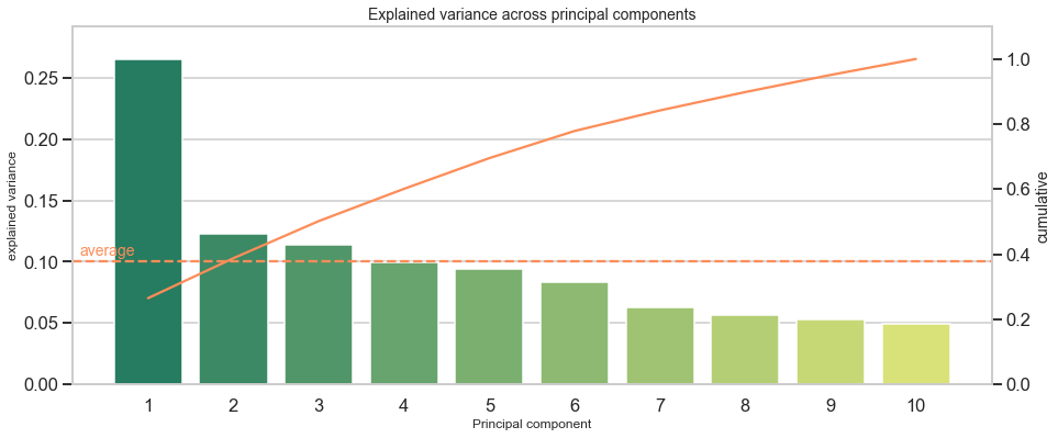
PCA Overview
========================================
Total: 10 components
----------------------------------------
Mean explained variance: 0.1
----------------------------------------
    explained variance  cumulative
1             0.265261    0.265261
2             0.122700    0.387962
3             0.113990    0.501951
4             0.099139    0.601090
5             0.094357    0.695447
6             0.083412    0.778859
7             0.063117    0.841976
8             0.056386    0.898362
9             0.052588    0.950950
10            0.049050    1.000000
----------------------------------------
Interpretation: The first component makes up for around 27% of the explained variance. This is relatively low as compared to other datasets, but no matter of concern. It simply indicates that a major share (100%-27%=73%) of observations distributes across more than one dimension.
Another way to approach the output is to ask: How much components are required to cover more than X% of the variance? For example, I want to reduce the data’s dimensionality retain at least 90% variance of the original data. Then I would have to include 9 components to reach at least 90% and even have 95% of explained variance covered in this case. With an overall of 10 variables in the original dataset, the scope to reduce dimensionality is limited. Additionally, this shows that each of the 10 original variables adds somewhat unique patterns and limitedly repeats information from other variables.

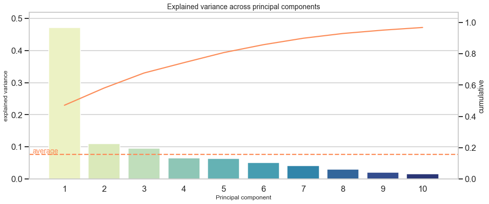
To give another example, I list explained variance of “the” wine dataset :
PCA Overview: Wine dataset
========================================
Total: 13 components
----------------------------------------
Mean explained variance: 0.077
----------------------------------------
    explained variance  cumulative
1             0.361988    0.361988
2             0.192075    0.554063
3             0.111236    0.665300
4             0.070690    0.735990
5             0.065633    0.801623
6             0.049358    0.850981
7             0.042387    0.893368
8             0.026807    0.920175
9             0.022222    0.942397
10            0.019300    0.961697
11            0.017368    0.979066
12            0.012982    0.992048
13            0.007952    1.000000
----------------------------------------
Here, 8 out of 13 components suffice to capture at least 90% of the original variance. Thus, there is more scope to reduce dimensionality. Furthermore it indicates that some variables do not contribute much to variance in the data.
Instead of plain text, a scree plot visualizes explained variance across components and informs about individual and cumulative explained variance for each component. The next code chunk creates such a scree plot and includes an option to focus on the first X components to be manageable when dealing with hundreds of components for larger datasets (limit).
#limit plot to x PC
limit = int(input("Limit scree plot to nth component (0 for all) > "))
if limit > 0:
    limit_df = limit
else:
    limit_df = n_components

df_explained_variance_limited = df_explained_variance.iloc[:limit_df,:]

#make scree plot
fig, ax1 = plt.subplots(figsize=(15,6))

ax1.set_title('Explained variance across principal components', fontsize=14)
ax1.set_xlabel('Principal component', fontsize=12)
ax1.set_ylabel('Explained variance', fontsize=12)

ax2 = sns.barplot(x=idx[:limit_df], y='explained variance', data=df_explained_variance_limited, palette='summer')
ax2 = ax1.twinx()
ax2.grid(False)

ax2.set_ylabel('Cumulative', fontsize=14)
ax2 = sns.lineplot(x=idx[:limit_df]-1, y='cumulative', data=df_explained_variance_limited, color='#fc8d59')

ax1.axhline(mean_explained_variance, ls='--', color='#fc8d59') #plot mean
ax1.text(-.8, mean_explained_variance+(mean_explained_variance*.05), "average", color='#fc8d59', fontsize=14) #label y axis

max_y1 = max(df_explained_variance_limited.iloc[:,0])
max_y2 = max(df_explained_variance_limited.iloc[:,1])
ax1.set(ylim=(0, max_y1+max_y1*.1))
ax2.set(ylim=(0, max_y2+max_y2*.1))

plt.show()
A scree plot might show distinct jumps from one component to another. For example, when the first component captures disproportionately more variance than others, it could be a sign that variables inform about the same underlying factor or do not add additional dimensions, but say the same thing from a marginally different angle.
To give a direct example and to get a feeling for how distinct jumps might look like, I provide the scree plot of the Boston house prices dataset :
Reasons why PCA saves time down the road
Assume you have hundreds of variables, apply PCA and discover that over much of the explained variance is captured by the first few components. This might hint at a much lower number of underlying dimensions than the number of variables. Most likely, dropping some hundred variables leads to performance gains for training, validation and testing. There will be more time left to select a suitable model and refine it than to wait for the model itself to discover lack of variance behind several variables.
In addition to this, imagine that the data was constructed by oneself, e.g. through web scraping, and the scraper extracted pre-specified information from a web page. In that case, the retrieved information could be one-dimensional, when the developer of the scraper had only few relevant items in mind, but forgot to include items that shed light on further aspects of the problem setting. At this stage, it might be worthwhile to go back to the first step of the work flow and adjust data collection.
Discover underlying factors with correlations between features and components
PCA offers another valuable statistic besides explained variance: The correlation between each principle component and a variable, also called factor loading. This statistic facilitates to grasp the dimension that lies behind a component. For example, a dataset includes information about individuals such as math score, reaction time and retention span. The overarching dimension would be cognitive skills and a component that strongly correlates with these variables can be interpreted as the cognitive skill dimension. Similarly, another dimension could be non-cognitive skills and personality, when the data has features such as self-confidence, patience or conscientiousness. A component that captures this area highly correlates with those features.
The following code creates a heatmap to inspect these correlations, also called factor loading matrix.
# adjust y-axis size dynamically
size_yaxis = round(X_std.shape[1] * 0.5)
fig, ax = plt.subplots(figsize=(8,size_yaxis))

# plot the first top_pc components
top_pc = 3
sns.heatmap(df_c.iloc[:,:top_pc], annot=True, cmap="YlGnBu", ax=ax)
plt.show()
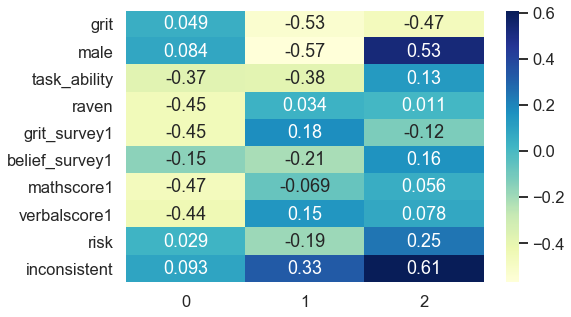
The first component strongly negatively associates with task ability, reasoning score (raven), math score, verbal score and positively links to beliefs about being gritty (grit_survey1). Summarizing this into a common underlying factor is subjective and requires domain knowledge. In my opinion, the first component mainly captures cognitive skills.
The second component correlates negatively with receiving the treatment (grit), gender (male) and positively relates to being inconsistent. Interpreting this dimension is less clear-cut and much more challenging. Nevertheless, it accounts for 12% of explained variance instead of 27% like the first component, which results in less interpretable dimensions as it spans slightly across several topical areas. All components that follow might be analogously difficult to interpret.
Evidence that variables capture similar dimensions could be uniformly distributed factor loadings. One example which inspired this article is a project of mine with Google Trends and self-constructed keywords about a firm’s sustainability ( https://philippschmalen.github.io/posts/esg_scores_pytorch_googletrends ). A list of the 15th highest factor loadings for the first principle component revealed loadings ranging from 0.12 as the highest value to 0.11 as the lowest loading of all 15. Such a uniform distribution of factor loadings could be an issue. This especially applies when data is self-collected and someone preselected what is being considered for collection. Adjusting this selection might add dimensionality to your data which possibly improves model performance at the end.
Another reason why PCA saves time down the road
If the data was self-constructed, the factor loadings show how each feature contributes to an underlying dimension, which helps to come up with additional perspectives on data collection and what features or dimensions could add valuable variance. Rather than blind guessing which features to add, factor loadings lead to informed decisions for data collection. They may even be an inspiration in the search for more advanced features.
Conclusion
All in all, PCA is a flexible instrument in the toolbox for data exploration. Its main purpose is to reduce complexity of large datasets. But it also serves well to look beneath the surface of variables, discover latent dimensions and relate variables to these dimensions, making them interpretable. Key metrics to inspect are explained variance and factor loading.
This article shows how to leverage these metrics for data exploration that goes beyond averages, distributions and correlations and build an understanding underlying properties of the data. Identifying patterns across variables is valuable to rethink previous steps in the project work flow, such as data collection, processing or feature engineering.
Thanks for reading! I hope you find it as useful as I had fun to write this guide. I am curious of your thoughts on this matter. If you have any feedback I highly appreciate your feedback and look forward receiving your message.
Appendix
Access the Jupyter Notebook
I applied PCA to even more exemplary datasets like Boston housing market, wine and iris using do_pca(). It illustrates how PCA output looks like for small datasets. Feel free to download
my notebook
or
script
.
Note on factor analysis vs. PCA
A rule of thumb formulated here states: Use PCA if you want to reduce your correlated observed variables to a smaller set of uncorrelated variables and use factor analysis to test a model of latent factors on observed variables.
Even though, this distinction is scientifically correct, it becomes less relevant in an applied context. PCA relates closely to factor analysis which often leads to similar conclusions about data properties which is what we care about. Therefore, the distinction can relaxed for data exploration. This post gives an example in an applied context and another example with hands-on code for factor analysis is attached in the notebook .
Finally, for those interested about the differences between factor analysis and PCA refer to this post . Note, that throughout this article I never used the term latent factor to be precise.
References
[1] Alan, S., Boneva, T., & Ertac, S. (2019). Ever failed, try again, succeed better: Results from a randomized educational intervention on grit. The Quarterly Journal of Economics, 134(3), 1121-1162.
[2] Smith, L. I. (2002). A tutorial on principal components analysis.